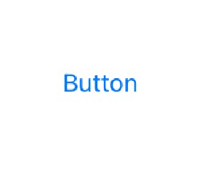
Buttons, one of the most common UI elements your users are going to interact with while using your applications. But if you rely just on basic options generated by Xcode, your buttons won't be all that appealing. If we look at how Interface Builder creates buttons by default...

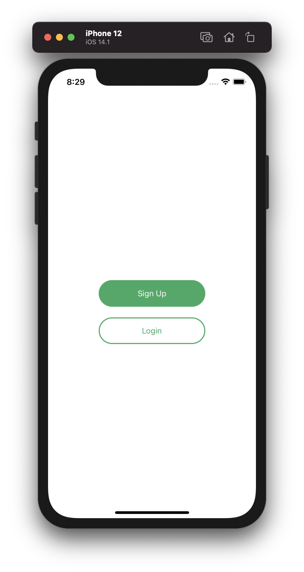
...it's not all that exciting, right? So, what can we do to make our buttons more interesting and visually appealing for users? By the end of this post, you'll understand how to make buttons like these:

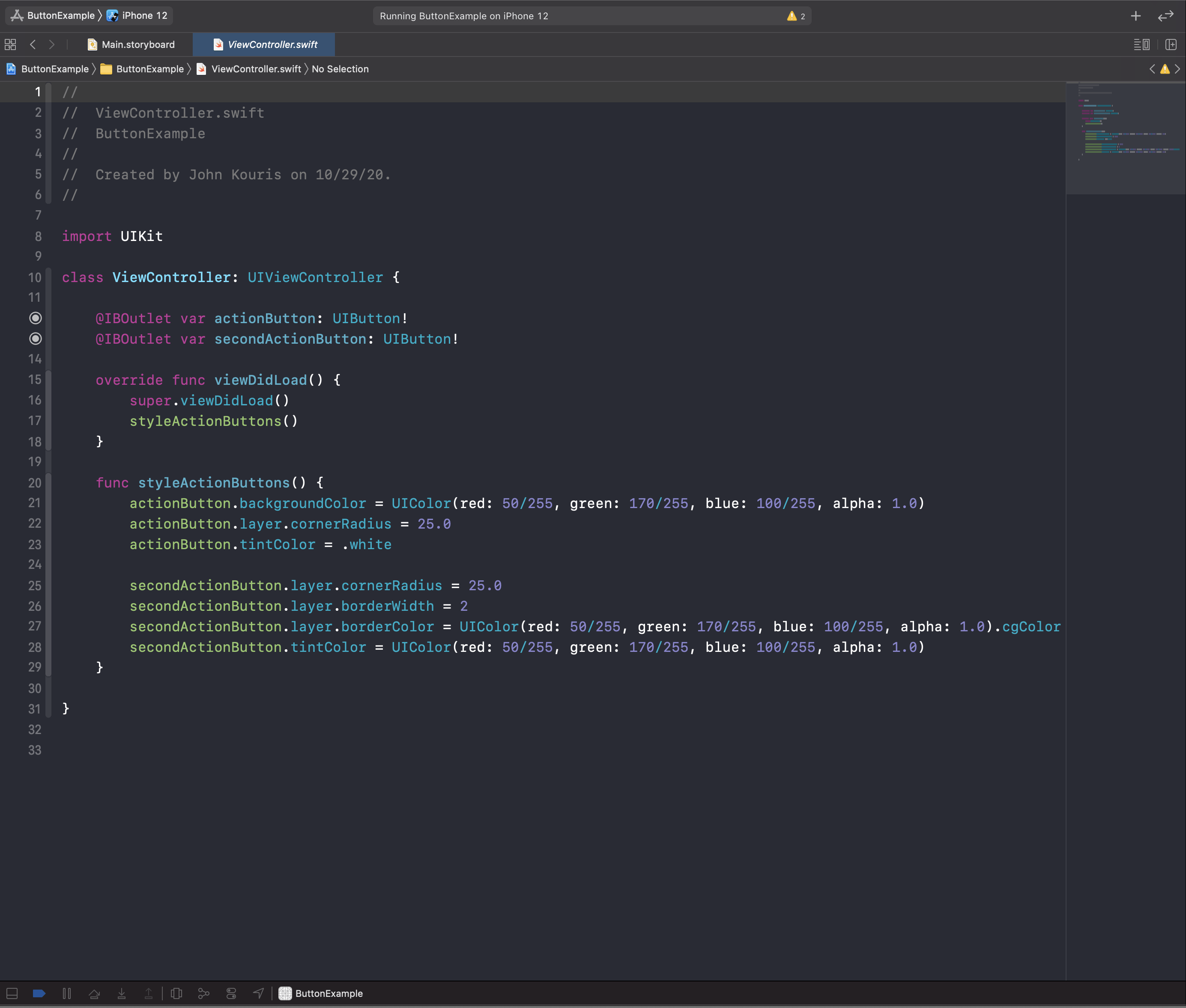
So much better! These buttons are more visually engaging and you might be surprised just how simple it is to get these kinds of results. Here is all the code you need to get those styles:

Creating Better Looking Buttons
If you've gone through part 1 of the Contacts app series, you should already understand how to set up IBOutlets while using Interface Builder. If you haven't seen it, go check it out! What's new here will be the specific properties we use on UIButton objects to customize them. Let's look at the styling we've applied to the actionButton.
actionButton.backgroundColor = UIColor(red: 50/255, green: 170/255, blue: 100/255, alpha: 1.0)
actionButton.layer.cornerRadius = 25.0
actionButton.tintColor = .white
Let's look at each of these line-by-line:
- The
backgroundColoris pretty self explanatory, this is the background color of the button. - Did you see how the buttons were rounded on the edges? This is the line that accomplishes that.
cornerRadiusapplies a rounding effect to the UIButton and accepts CGFloat values. - Finally, the
tintColoris the color that gets applied to the button's title and (if there is one) its image.
Now, let's check out the code for the secondActionButton.
secondActionButton.layer.cornerRadius = 25.0
secondActionButton.layer.borderWidth = 2
secondActionButton.layer.borderColor = UIColor(red: 50/255, green: 170/255, blue: 100/255, alpha: 1.0).cgColor
secondActionButton.tintColor = UIColor(red: 50/255, green: 170/255, blue: 100/255, alpha: 1.0)
Notice, a lot of this code is very similar to our first button:
- Same as the first button, we are using the
cornerRadiusproperty to get that rounding effect for our button. - The
borderWidthproperty is the width of any border that you want to add to your button. Experiment with the values here and see what happens! - The
borderColordefines the color of the border that we create for our button. This property is of type CGColor, so we tack on the.cgColorat the end of the line to convert theUIColorto aCGColor. - Like the first button, we can define the
tintColor. In this case, we use a customUIColorthat matches the color of the border of this button and the background of the actionButton.
Wrap Up
And that's it! With just a few lines of code, we can create more visually engaging buttons for our users. Go ahead and experiment. Change the border widths, change the colors, change the corner radii. What are some other ways you can define custom UIColors? Remember, you can always drop a comment in this post or ask Google if you get stuck :)
Happy coding!
